
The company
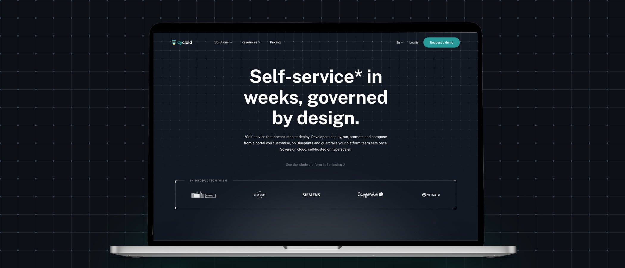
Cycloid is a French software company whose product is both an internal developer platform and an internal developer portal. Platform teams start from Cycloid’s ready blueprints instead of building their own, and developers serve themselves inside the guardrails those teams set. Its customers include large enterprises such as Accenture, Capgemini, Orange Business Services and Bank of Cyprus: CTOs and platform teams who buy it, and the engineers who use what those teams build.
- Founded2015
- WhereFully remote, across Europe, North America and Asia
- ProductCompany website and internal developer portal and platform
- Websitecycloid.io ↗
The mission
Cycloid speaks to three audiences at once: the platform teams who build on it, the developers who use what those teams build, and the executives who decide and pay, often in large or regulated organisations where governance and security come first. None of them can try the product from the website, so the site has to show each visitor, within seconds, what Cycloid does for them, and earn the demo request rather than ask for it first. The question behind the work:
How do you make platform teams, developers and executives trust a product they cannot try, enough to book a demo?
My role
I joined Cycloid in November 2024 as its sole web designer, working remotely, first from Copenhagen, then from Hong Kong, and reporting directly to the product manager and the CEO. My role covers cycloid.io, the company-facing website in English, French and Spanish, built to bring in demo requests for the sales team, and most of the company’s design output.
It came in four chapters: the migration and redesign of the site on WordPress, a year of running and measuring it with the team, the arrival of AI in the marketing team, where I lead the web and technical side, and V2, a second full redesign, built with AI.
The migration and redesign: Drupal to WordPress
The brief. When I joined, cycloid.io was built on Drupal, and every new page went through a long chain. A UX designer drew detailed wireframes in Figma, an agency in Spain built them in code, and the pages then went to our data manager for review. Most came back for another round before they were published, so a single page took two months at least, and the site aged faster than the product it described. In an internal survey I ran in December 2024, colleagues described the website plainly: cluttered, a patchwork, and “users don’t know within ten seconds what we do”.
The migration and redesign. Moving off Drupal was my own initiative. After a few days of working in it, I saw how slow every change was, and proposed a migration to the CEO. I chose WordPress: easier to maintain and widely known, with plugins that could grow with the company, a visual page builder in Elementor Pro, and low costs. The move was also a full redesign: header and footer, site structure, wording, images and a new UI kit, all reviewed. It took under three months and went live in May 2025.
Drupal, 2024

V1, 2025

The result. I ran the same survey again in early 2026. In 2024, 24% of participants rated the site worse than competitors’; in 2026, 0% did. The first words moved from “cluttered”, “mess” and “patchwork” to “clean, sleek design”, “clarity” and “strong branding”.
Running the site with the team
After the migration came a year of running the site with the team. I made every new page with our content writer, the words from the writer and the structure, design and build from me; connected the site to GA4, HubSpot, Wistia, Clarity and Hotjar; took care of SEO and GEO, how Cycloid is cited in AI search; set up a monthly website performance review in Notion, with a reading of the numbers and a recommendation for the CEO; and trained colleagues to work in WordPress, so they could check and update their own content with confidence.
AI arrives in the team
The shift. In about three months, AI went from something the company was careful about to part of everyone’s daily work. Our content writer and I took over AI in the marketing team: the writer on the copy side, me leading the technical side, around the website and the automation of pages, blog posts and publications.
The workflows. I built the team’s AI design ops with Claude Code: skills and flows that port pages to WordPress, publish blog posts, localise them into French and Spanish, and pull analytics for the monthly reports.
Bringing people along. Not everyone came at the same pace. Some colleagues simply wanted their work done faster; others were more sceptical at first, and we took weeks of introduction sessions together. What convinced people most was seeing AI in my own daily work. Connected to WordPress, Claude Code lets me create pages exactly as I envision them, without compromising on the UI or the UX. It doesn’t design for me: it extends what I can do as a designer, and showing that, page after page, is what built trust. From there, I onboard colleagues through walkthroughs, test shadowing, written guidelines and video recordings, so each of them can use these workflows in their own work.
Designing V2, with AI
Why a second redesign. In 2026, Cycloid launched a completely new product, and the website had to tell a new story. Rather than patch V1, I redesigned the site again from the ground up.
The brief. My research looked at what makes engineers trust a product site, and what makes them leave. Clear use cases and real documentation came first for trust; a lack of concrete examples and abstract wording were the top reasons to leave. That became the brief for V2: proof before the demo, concrete examples, and no marketing talk.
The proof. The product appears as short clips I produced for each feature page, so visitors see the thing rather than a drawing of it.
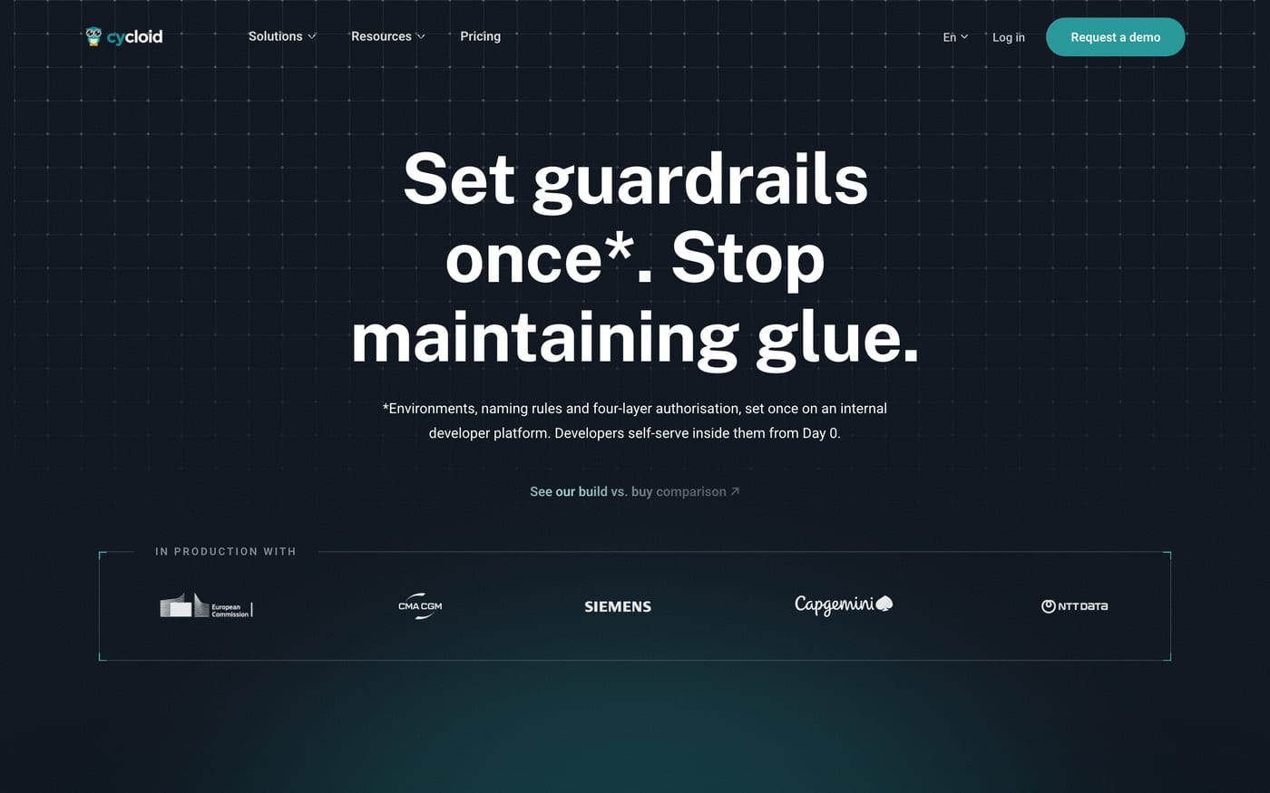
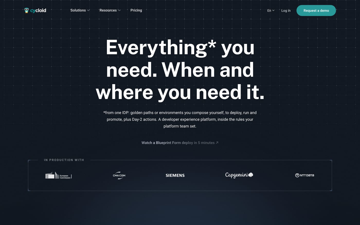
Who we were designing for. Every visitor first meets one question, “What do you need today?”, and each answer opens a homepage of its own: the product’s promise in that audience’s own words, with the customers right under it.
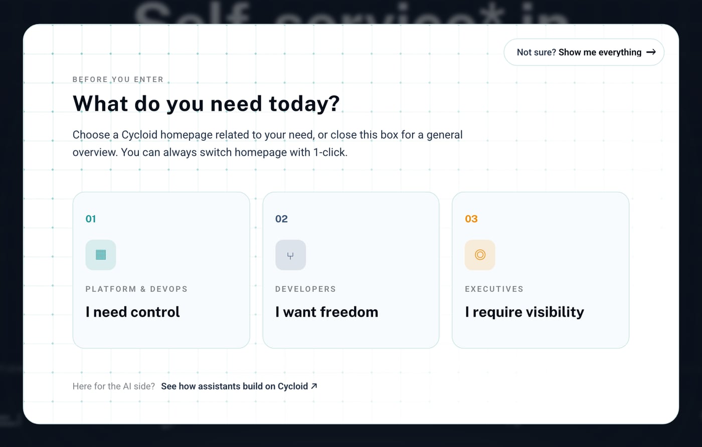
01 · Platform & DevOps
02 · Developers
03 · Executives
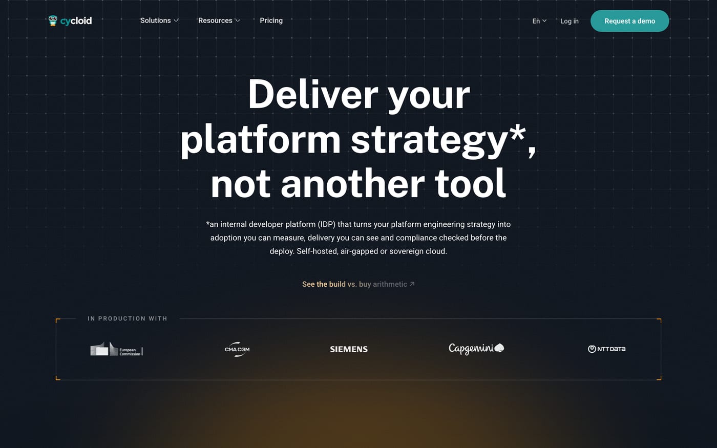
Built with AI. V2 started at the end of June 2026 and went live in September, designed and built with Claude Code as my partner. I designed every page as an HTML wireframe, component-first: each shared element was locked once in a UI kit and reused, so three homepages and every feature page stayed consistent while each spoke to its own audience. Claude Code skills then ported each page to WordPress and localised it into French and Spanish.
V1, 2025
V2, 2026

The result. V2 went live in September 2026, and the first signs are strong: organic search reached the highest month in the site’s history, up 57% on the year before, and demo-request conversion tripled year on year.
Source: GA4 and HubSpot, Cycloid's monthly website reports.
Working with a remote team
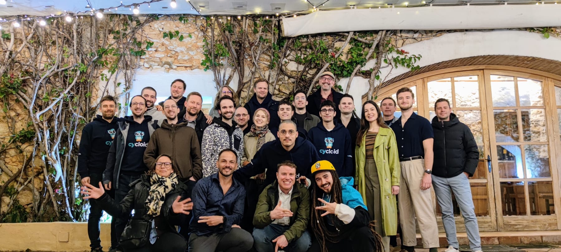
Cycloid is fully remote, with people spread across the world: mostly in Europe, some in North America, and me in Asia. In a company like that, communication is part of the design work: written briefs and updates anyone can pick up, recorded walkthroughs, reviews that work across time zones, and the days together kept for what only works in person.
Internal surveys, workshops and card-sorting exercises were my way of bringing colleagues into the design work: giving them a voice, and understanding how they see the website and the people it is for.
Takeaways
- Empathy applies to how I work, not only to what I design. A new tool never lands the same way for everyone: some colleagues are eager, others sceptical or firmly against it. Taking the time, helping proactively and choosing my words with care matter as much as the tool itself.
- Sometimes the biggest UX gain is in the workflow behind the screen. Cutting page creation from two months to a week did more for the website than any single page design: it let the site keep pace with the product, and let the team run it without waiting on one person.
- Share work early with the people who hold the context. Managers and stakeholders often know something the brief does not. Reviewing work in progress costs less than redoing finished work.
- Distance changes how you design with people. When a team rarely shares a room, research and co-creation have to travel: surveys, remote workshops and recorded walkthroughs bring everyone’s knowledge into the work.