The company
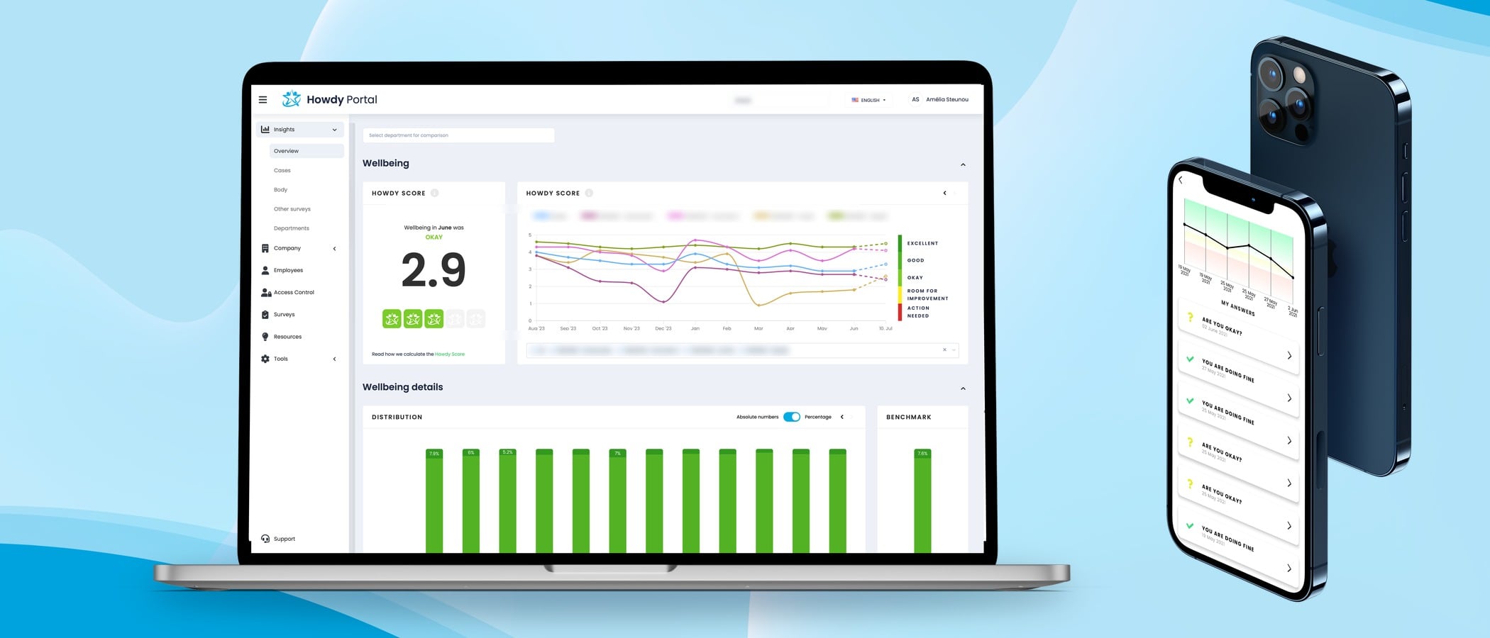
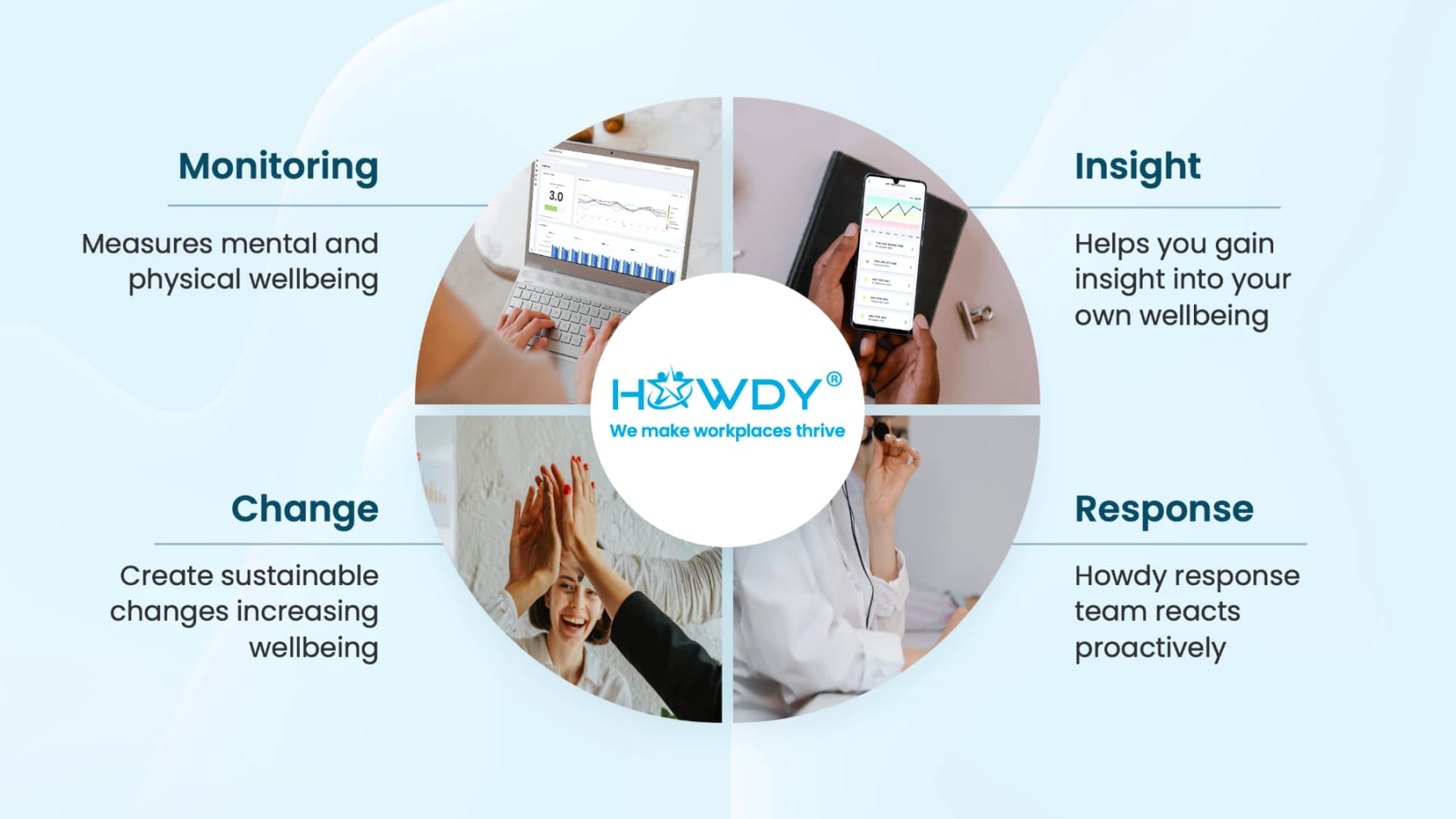
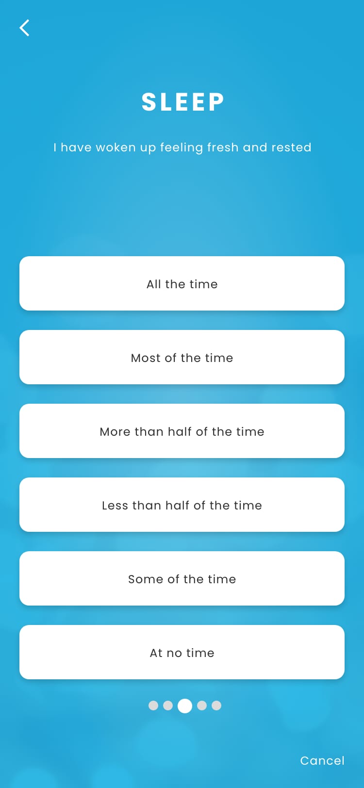
Howdy (howdy.care) was a Copenhagen company that helped organisations look after employee wellbeing. Every week, employees answered a five-question check-in in the app, in about 45 seconds. When the answers showed someone was struggling, a psychologist or physiotherapist from Howdy’s response team reached out, confidentially and free of charge. Managers and HR followed their teams in the Howdy Portal, without ever seeing an individual’s answers.
- Founded2014Acquired by HR-ON, 2024
- WhereCopenhagen, Denmark
- ProductMobile app and web portal
The mission
Howdy’s promise was in its line: we make workplaces thrive. But it was bought by HR and managers, not by the employees who used the app, so it rested on a business case: a drop in wellbeing nobody notices tends to end in a stress-related sick leave, and one leave cost more than enough to pay for Howdy.
Source: Howdy's business case for a Danish client, May 2023. Scores on the WHO-5 scale.
So the product had to do two things at once: catch the drop early, which only works if employees trust their answers stay confidential; and show managers enough to act and justify the investment, or they stop opening it. Every screen sat between those two needs. The question behind my work:
How do you turn a team’s wellbeing into a number a manager can act on, without revealing a single person’s answers?
The product
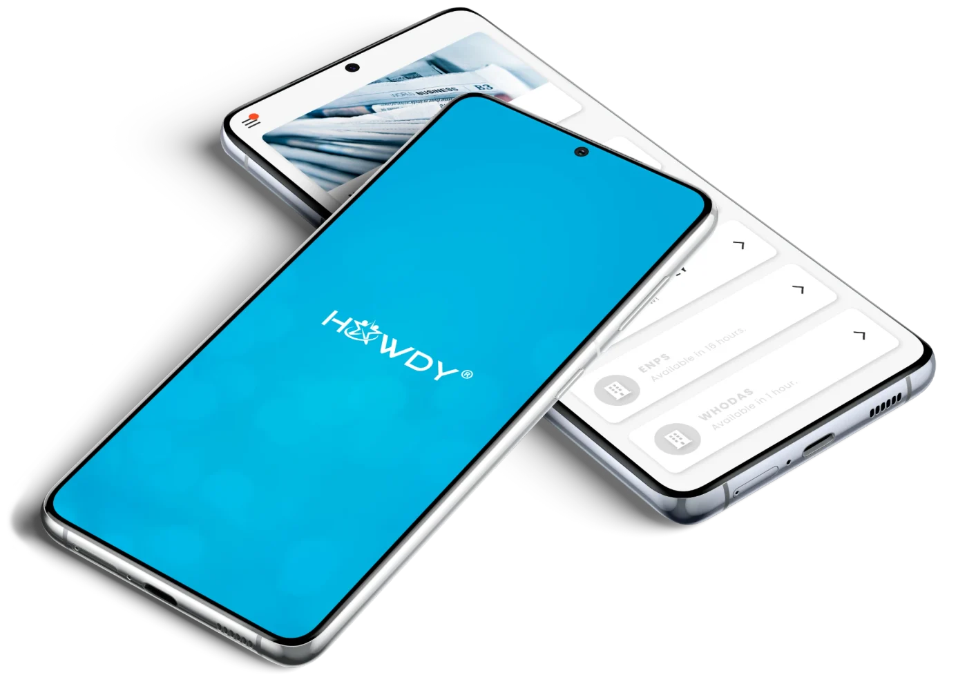
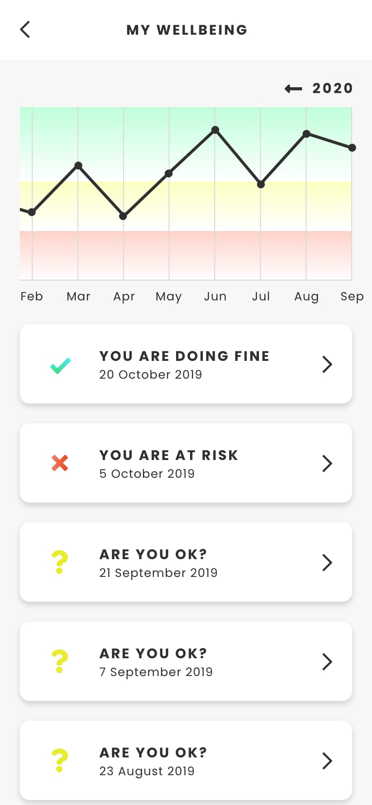
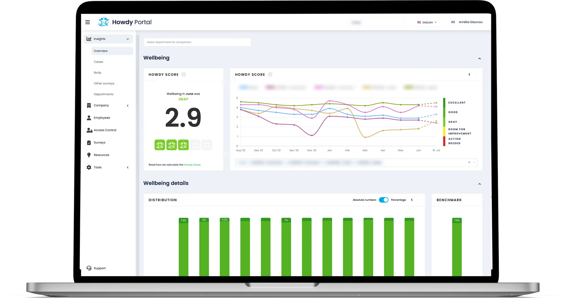
Employees used the app, on iPhone and Android: the weekly check-in, a few modules that unlocked on their own schedule, and graphs of their own wellbeing. Managers and HR used the Howdy Portal, where each team’s wellbeing appeared as a score, with its trends and the response team’s cases.
Between them sat the response team, Howdy’s psychologists and physiotherapists. The product only worked if both sides trusted what the other could and could not see.
Three views carried the service:
My role
I joined Howdy in September 2021 as its sole UX/UI designer, working with the product managers and the developers. The core of the job was the Howdy Portal, the side managers and HR paid for: I reviewed it, then redesigned most of it, from its data visualisation and the Howdy Score to access control, survey templates and reporting, and worked out with the developers the data models that decide what a manager may see. I ran the user research on both sides of the product, and also designed the logo, the website, sales material and LinkedIn campaigns. The thread through all of it: how much to show, to whom, and in which words.
UX researcher: both sides of the product
The app survey. From February to April, 108 employees rated the app 3.6 out of 5, and 86% had never had a difficulty using it. They liked the simple interface, the minute of reflection and their own graphs. What they missed was relevance: one in five could not name its most useful part, and nobody who had used it for more than six months still opened it weekly. My conclusion: users were not complaining about something that existed, but about something that did not exist yet.
It also showed two groups wanting different things: managers valued the score and graphs and did not mind more notifications; employees valued the response team and exercises, and found notifications a frustration. So the next survey went to the portal.
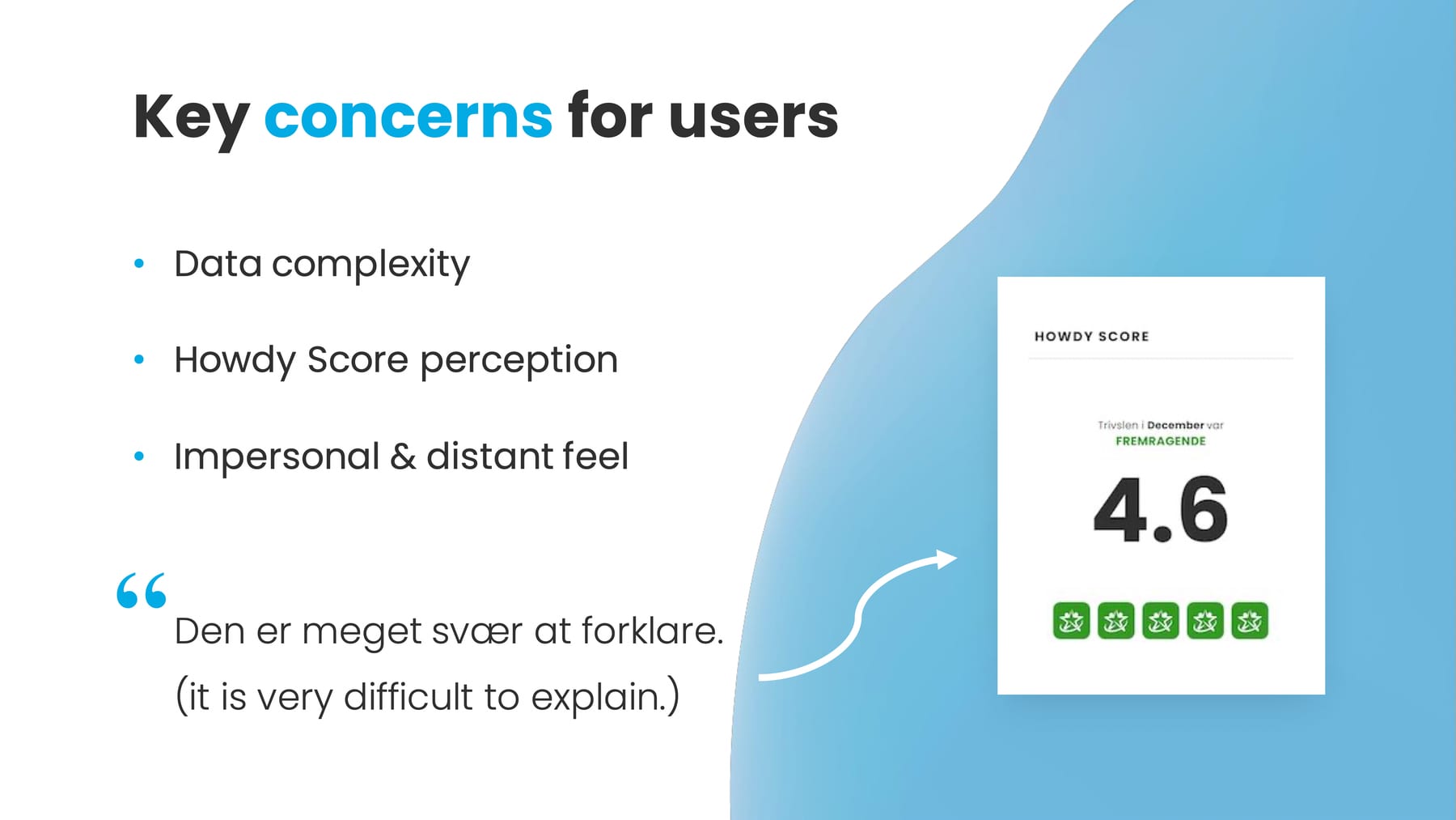
The portal survey. I asked managers and HR the same kind of questions, in English and Danish. They found the portal simple, fast and visually clear, with data they trusted. The concerns were the complexity of the data, how the Howdy Score was understood, and an impersonal feel; one answer summed it up: “it is very difficult to explain”. Asked which feelings mattered most in a work tool, a question borrowed from Carine Lallemand’s UX cards, they chose competence and efficiency, then security and control: more telling than a usability score.
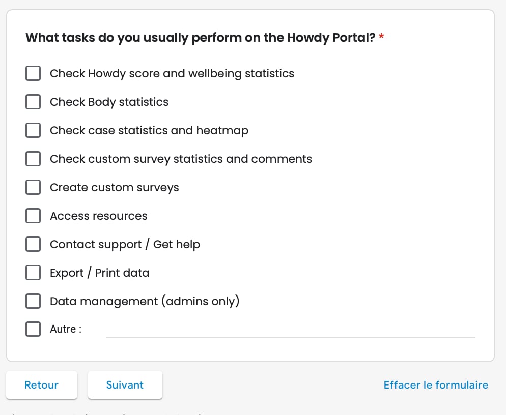
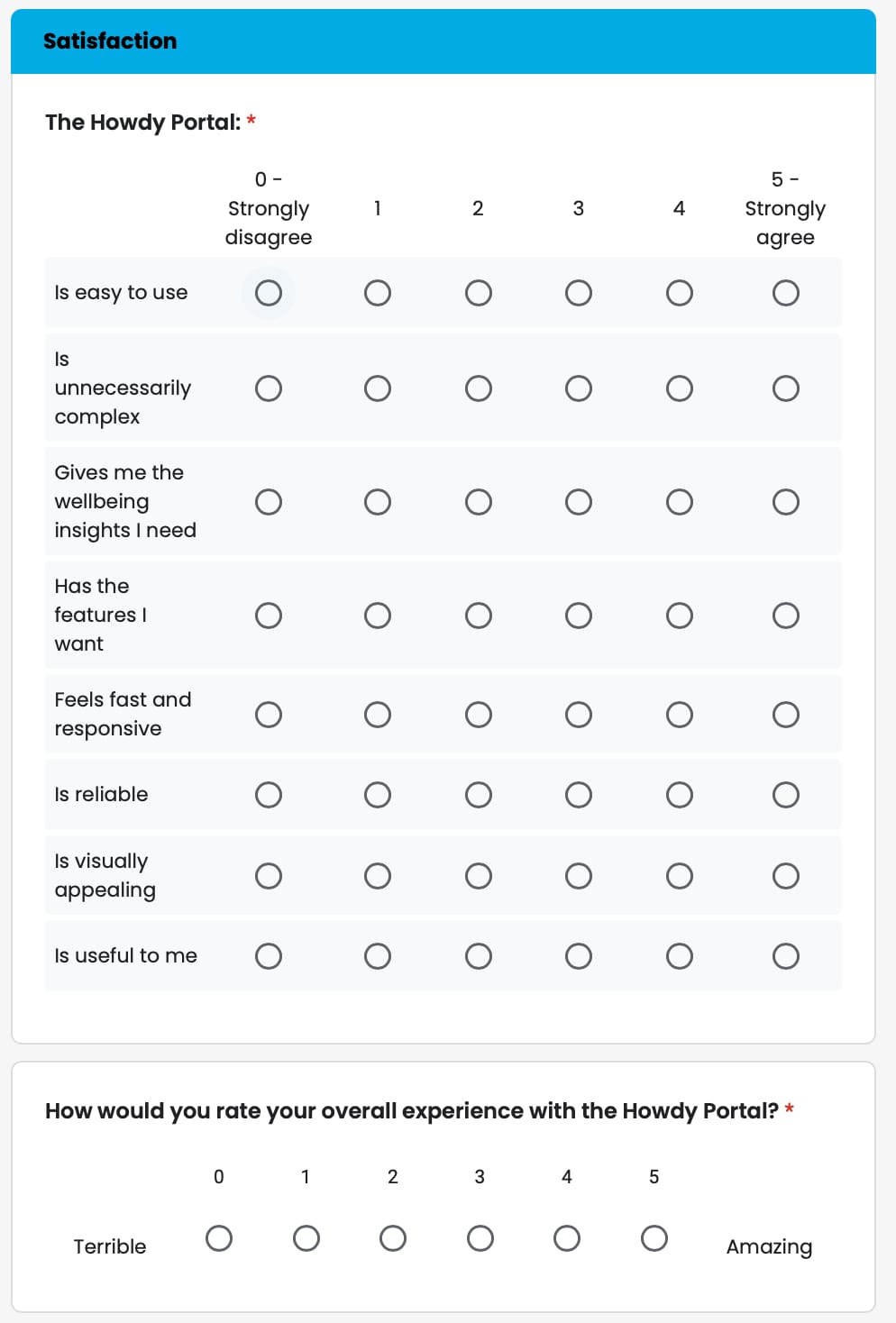
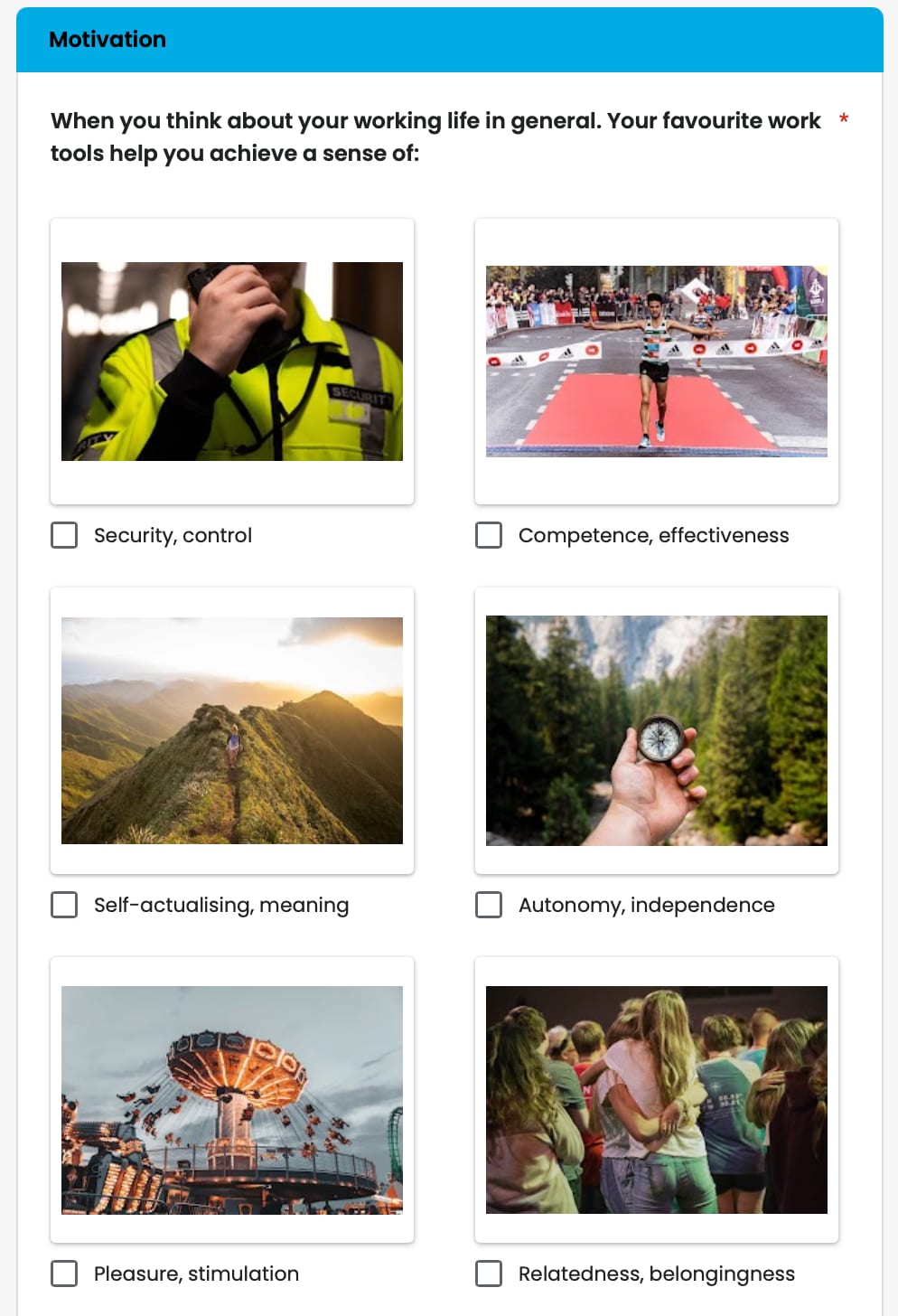
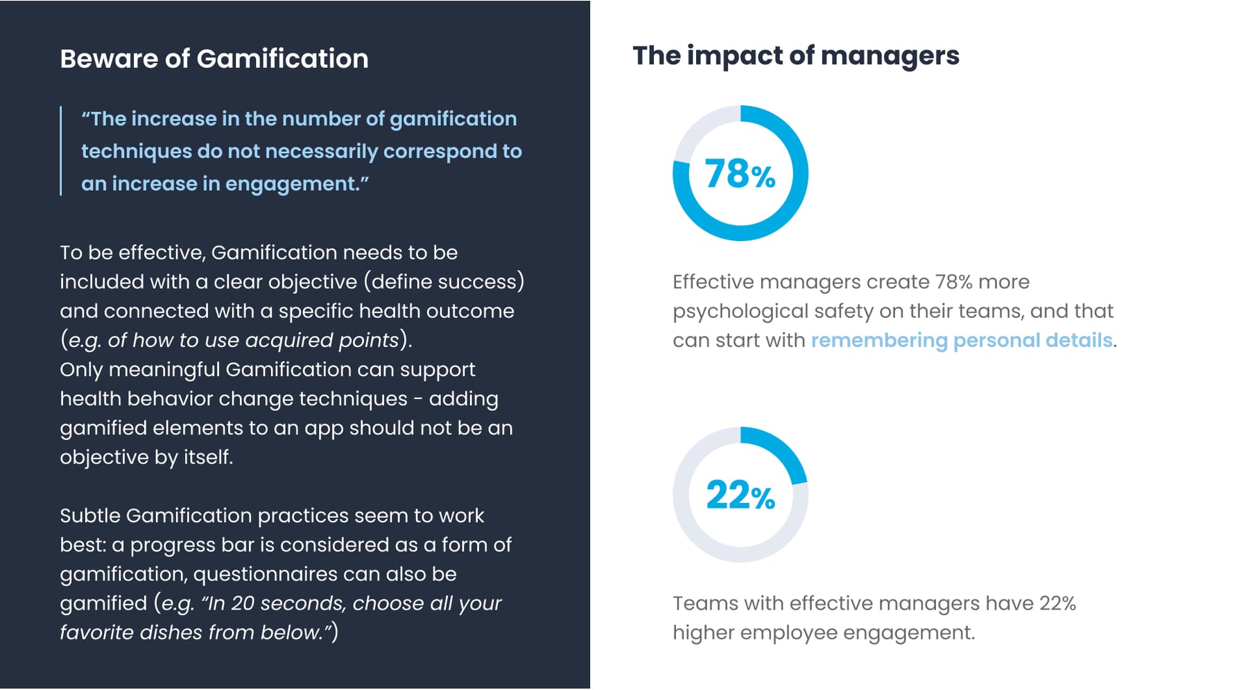
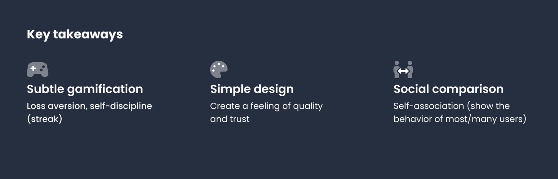
The desk research. I also wrote a report on what drives engagement in wellbeing apps. Two findings shaped my work. Gamification only helps when it is meaningful: tied to a health outcome and kept subtle, like a progress bar. And managers matter: teams with effective managers show more psychological safety and higher engagement, which is why the portal deserved as much care as the app.
Elements of my in-depth research on gamification, and how it links to trust and wellbeing
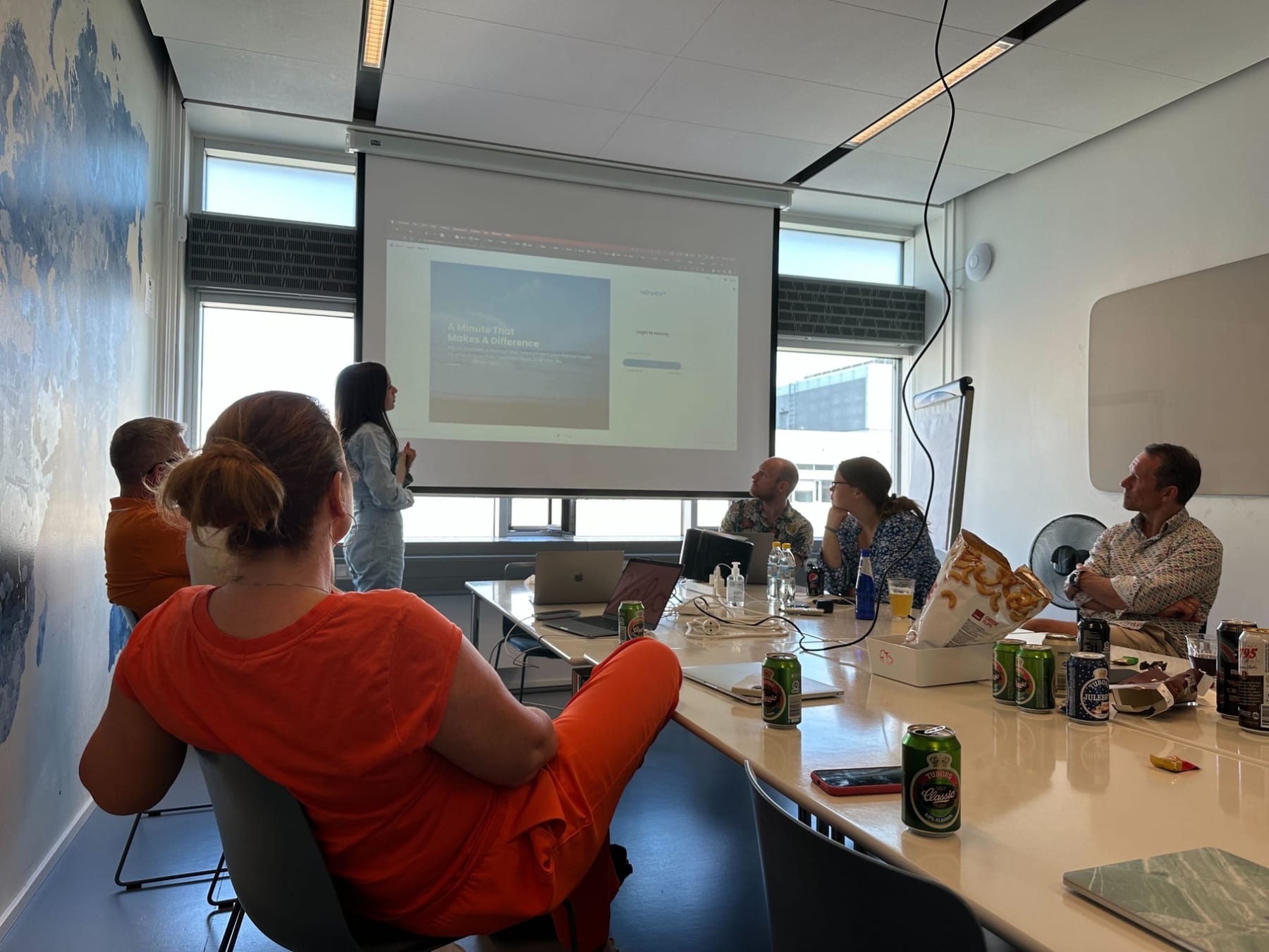
Sharing it, every time. I shared findings with product, sales and management along the way, and presented each study to the whole company: what we learned, what it means for the product, and what I proposed next. That is how the company came to work from the same picture of its users.
UX/UI designer: the Howdy Portal
The review. I reviewed the portal as a whole: calls to action lost in the background, look-alike controls that did different things, filters far from their chart, and, in depth, how the portal shows its data: colour key, metrics, which graph fits which question. It became the backlog the product managers and I worked through.
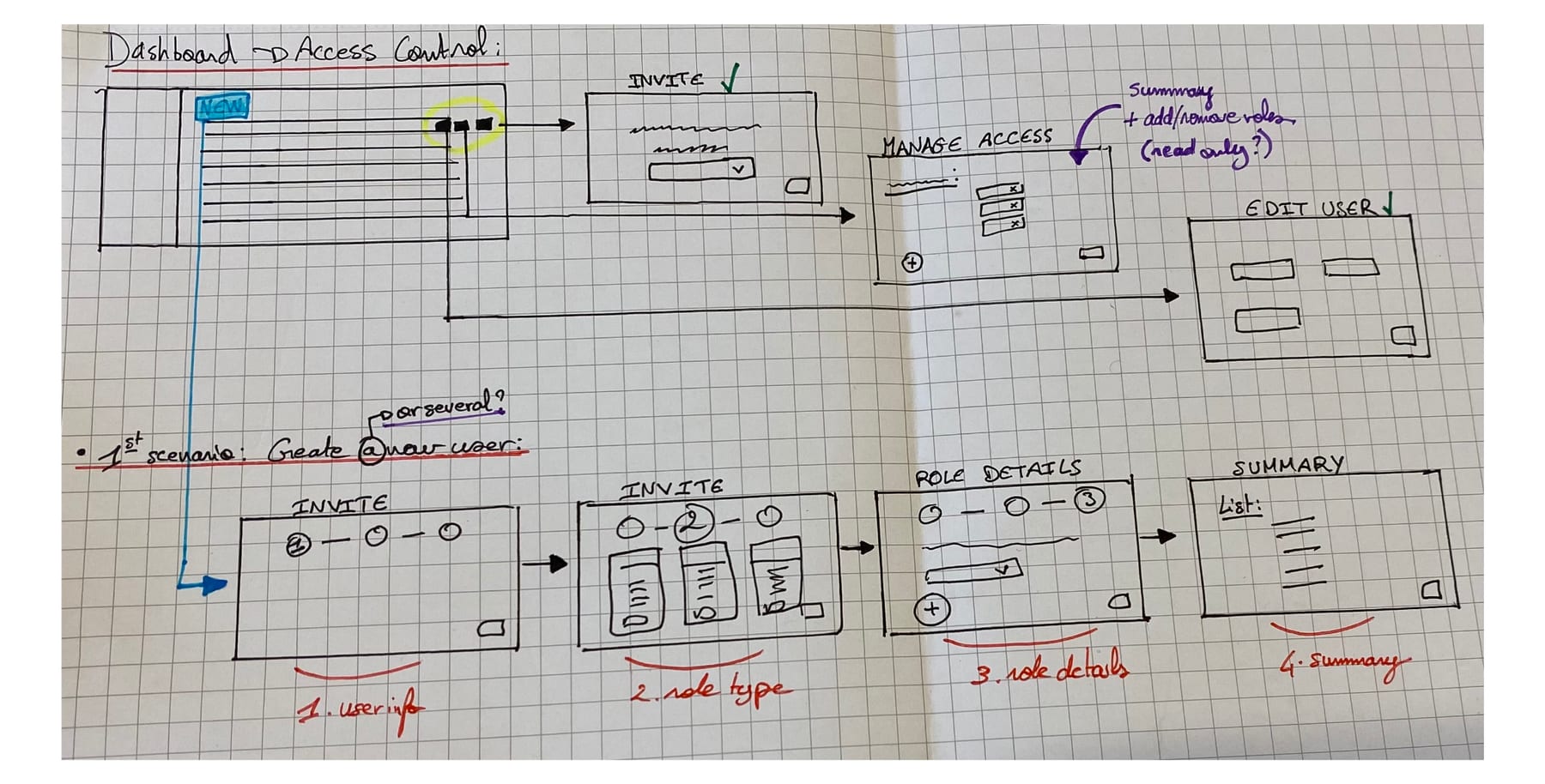
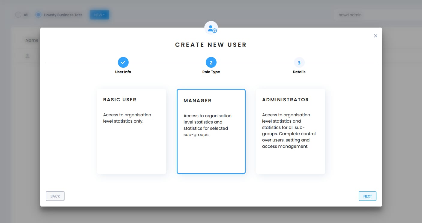
Access control. Administrators decide who sees what, and the portal made it hard: Howdy staff lost among thousands of employees in long lists, unclear roles, no feedback after a change. I redrew it from a paper sketch into a flow in steps: invite, choose a role, set its details, check the summary. With role-based access, the role decides what someone can see, so this is where confidentiality is set.
Then came what administrators kept asking support to do: locking or deleting a manager who had left, choosing a department’s contact person, seeing who receives the monthly report, and a clearer summary after a bulk invitation.
Surveys and reporting. I designed the survey templates, so companies could start their own surveys through Howdy more easily, and the department reporting, which shows which department each written answer came from, never which person.
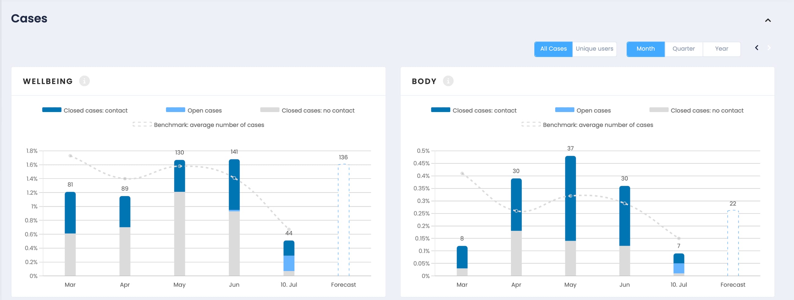
With the developers. I worked closely with the development team, in Bratislava and Copenhagen, through weekly check-ins, discussions on features and priorities, and QA. Together we worked out how sensitive information is modelled and shown: what is aggregated, what stays hidden below a group size, what a manager can and cannot drill into. Nobody sees this part of the work; everybody depends on it.
The Howdy Score redesign
The problem. The portal summed up a team’s wellbeing as a Howdy Score from 0 to 5, in stars, with a word: okay, good, excellent. Managers liked one number, but could not say what it meant, whether 2.9 was worrying, or what to do about it.
How the number works. Five questions, each scored from 0 to 20, give each employee a wellbeing score from 0 to 100, which places them in green, yellow or red. A group’s score is the average of its members’: a thermometer for the group, never a view of any one person.
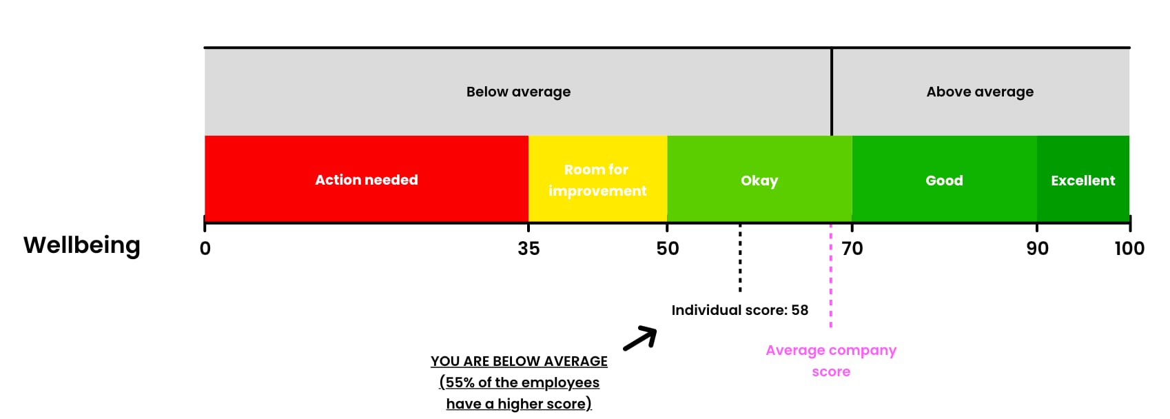
The redesign. I rebuilt it around that logic and the question managers actually ask: are we doing well, compared with what? It became the Wellbeing Index, on the employees’ own 0–100 scale, saying in words what it means, how it moved since last month and where it sits against the Danish average. The words come from the team’s distance to a general average built from hundreds of thousands of Howdy answers and European WHO-5 studies:
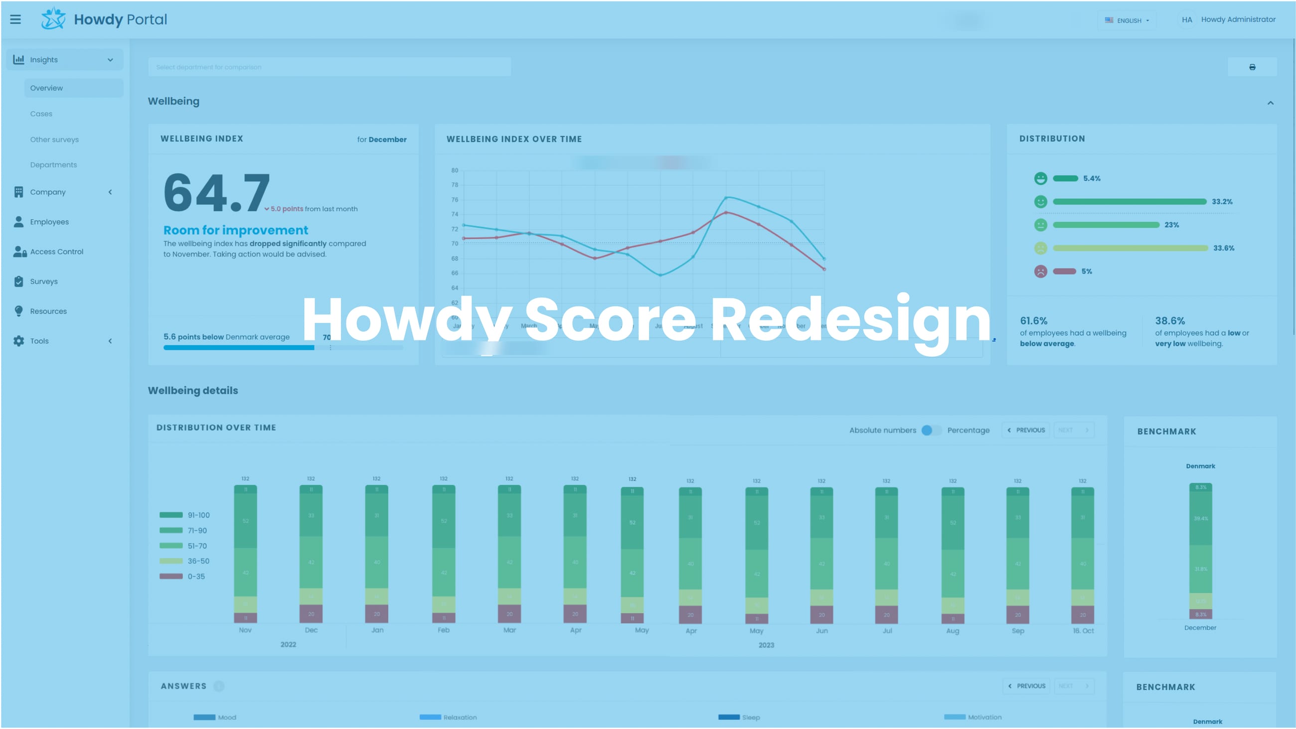
The result. Managers no longer had to interpret stars: the index said whether the team needed attention, and the benchmark showed whether it was the team or a hard month for everyone. It shipped with the rest of the dashboards.
The UI kit
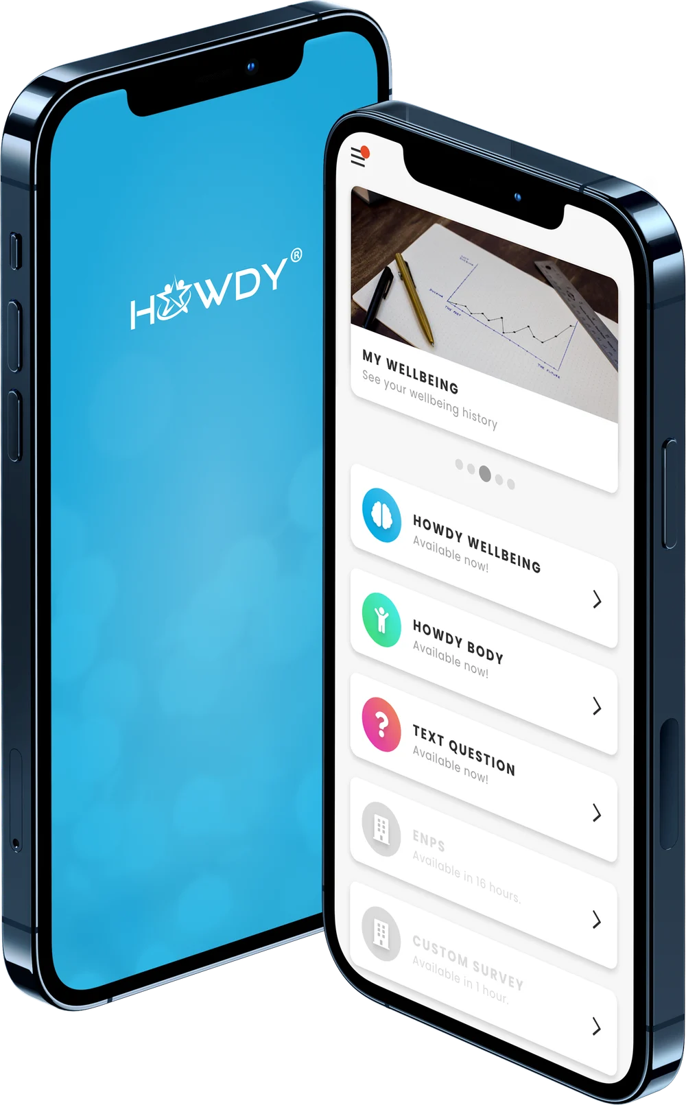
Why. The app and the portal had grown screen by screen, each feature with its own buttons, spacing and colours. With one designer for two platforms, consistency could not depend on me reviewing every screen.
What. I built and governed a shared UI kit in Adobe XD: foundations, components, the patterns the portal repeats, and the rules for accessible data visualisation that came out of the review.
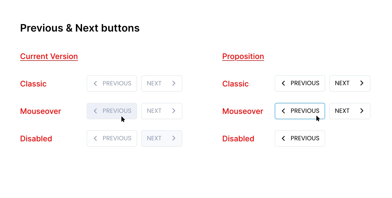
How it was used. Every design reached the developers built from the kit, with its states and edge cases, and we reviewed it together before it was built. QA could check a screen against the kit instead of against my memory.
Graphic designer: the Howdy logo
Where it came from. By 2023 the logo, HOWDY in capitals with a star of figures inside the O, felt sharp and corporate for a product whose promise was to be approachable.
The mark. I designed it alone, in Figma, exploring many directions; the team chose a single word in rounded lowercase. The curves make it organic and human, the lowercase drops the corporate voice, and it holds on an app icon, a dashboard header or a LinkedIn post.
What it started. Live across the website, the app and social media from early 2024, it sparked the wish for a complete redesign of the Howdy platform around its curves, which the acquisition by HR-ON overtook.
Web and graphic designer: the website, the decks and the campaigns
The website. I ran Howdy’s WordPress site and its landing pages. For its planned rework I started from what HR managers come looking for, fewer sick leaves, retention, an employer brand, and cut what stood in the way: repetitive product pages, stock photos, a front page that explained everything before the benefits.
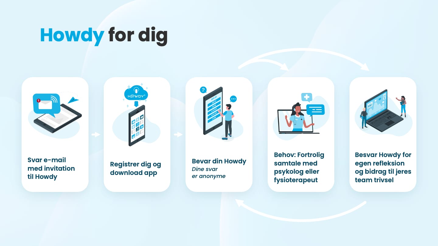
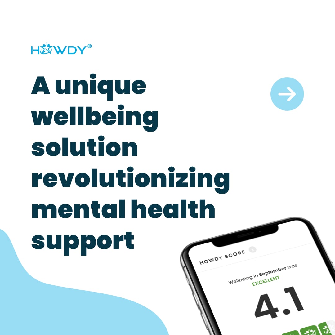
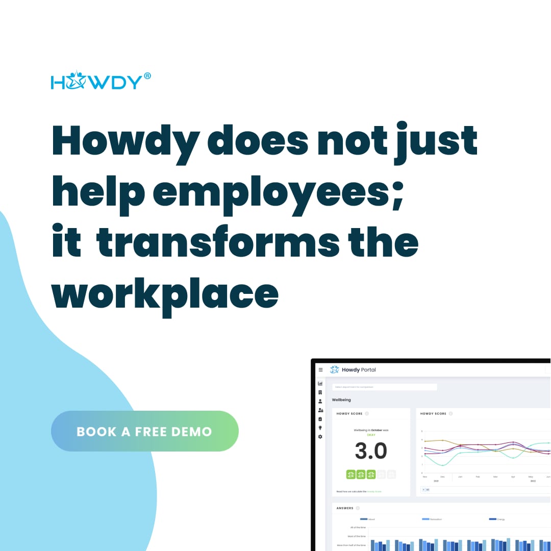
The decks and the campaigns. I designed some of the sales and kick-off decks, in Danish and English, a master template so every colleague could build an on-brand slide, and the LinkedIn carousels, ads and motion videos.
Working with the team
Most of my product work happened with Howdy’s two product leads, Mads and Morten, and with the developers.
Amélia is a very knowledgeable product designer with a deep level of expertise in different areas of product design. All the way from understanding the culture of the humans the product is designed for to actually drawing the lines on a mockup. The product is much better for it and the development team always appreciates the attention to detail that is evident from the design proposals.
Mads Dørup
Lead Technology Specialist

What carries on
In 2024 HR-ON bought Howdy for what we had built together: a product that worked, years of wellbeing data and an impressive client list. The app and the portal have since closed, but the acquisition says the work was worth carrying on.
I learned as much from how the company worked: the response team calling people before they asked, colleagues running kick-offs and data reviews with clients in person, sales, care and product working hand in hand. The product was only one part of the service; the care behind the screen made the screen trustworthy.
And trust is not a privacy page: it is privacy by design, built screen by screen, in what a role can see, what a score says and what happens when someone answers red. I take that, and the habit of researching both sides of a product, into every project that holds sensitive data.
Takeaways
- Anonymity is what makes the data true. People answered honestly only because nobody could see who said what. Protect that first, and the insights follow.
- One product, three meanings of wellbeing. Reflection for the employee, a signal for the manager, a cost for the company: the design had to serve all three without letting one take over.
- A number is only useful with a comparison and a next step. The Howdy Score became readable once it said where a team stood against the average, and what to do about it.
- Research is a habit, not a project. Three years of small surveys and shared findings changed the product more than any single study could.